TRENDS
Designers create collections well in advance of the coming year, allowing those of us
in the home furnishings industry a sneak peek into the future! Trends generally
reflect the collective mood of the world, and like Switzerland, design color experts
are staying neutral. We see a move toward calming natural colors with neutral
browns anchoring vibrant accent colors. Pinks, blues, purples and vivid yellows
brighten our lives with mixed metallic adding some sparkle!
From lighter camel tones to dark chocolate, brown is now showing up as the anchor
in almost all collections. Grey isn’t over but the newest trends in color make grey
the secondary neutral rather than the lead. Greys are warming more and moving
toward warm sand and concrete. Never fear though, die hard grey fans; there are
still tones of cool options with something to be comfortable. I am also seeing plenty
of beige and ivory mixed with gold for the latest trends.
With brown in the spotlight, the entire home furnishing and design pallet has been
influenced to warm up. When it comes to color, design experts are moving from
bright “in your face” wow factor colors, to calming natural colors. Think subdued.
The colors are modified just enough to spike interest, but not to shock or wow you.
Currently, I am crazy for blush and note that millennial pink not going away any
time soon.
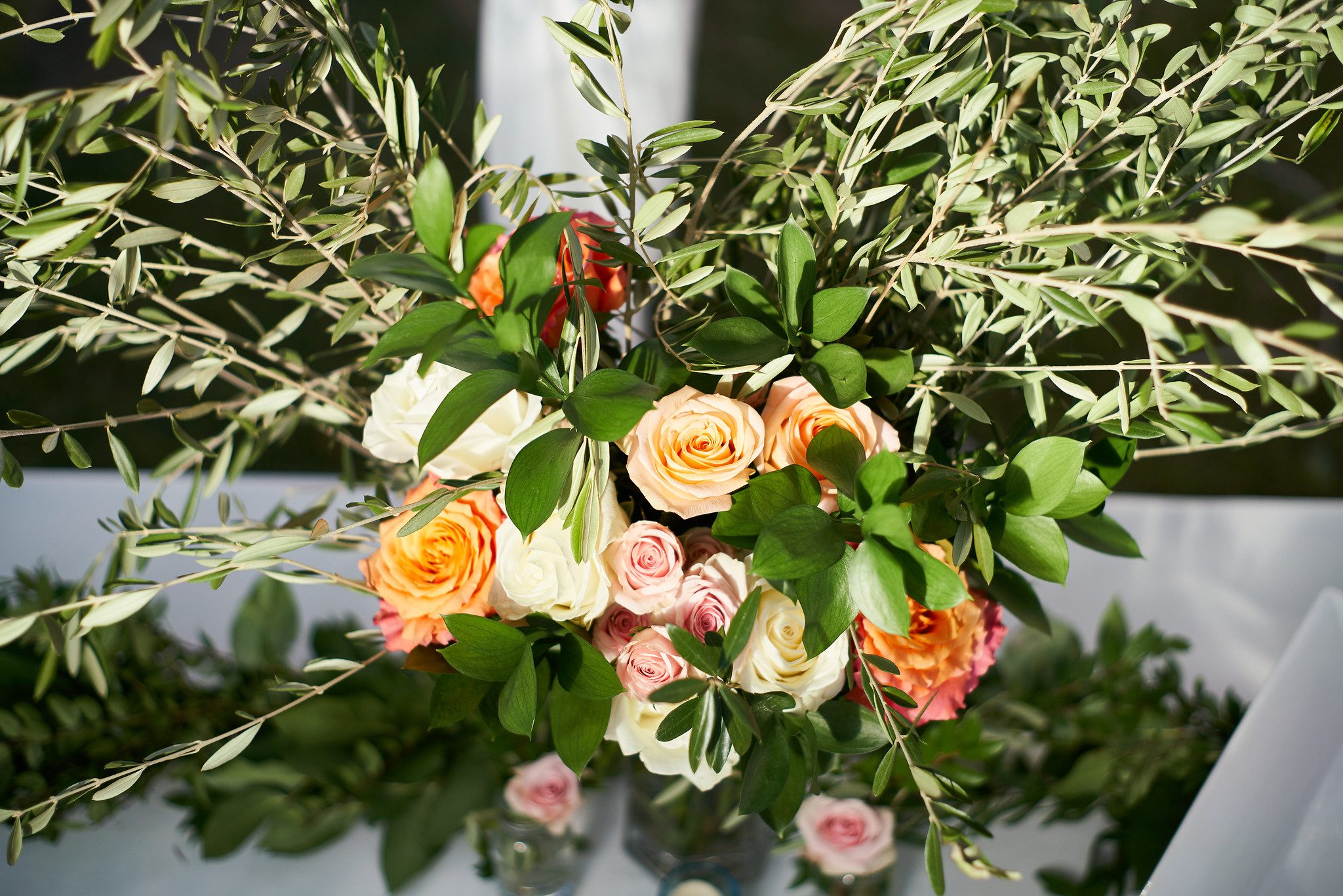
Mixed with lighter colors, blush makes everything fresh and calm. With a lot more
yellow influence, warmed up greens mixed with pink is a fresh more vibrant
balance. With the green and yellow combinations popping up, think fall. Greens are
rising through 2019 and becoming warmer. Bright green is taking a back seat to
more natural and organic shades of green. Dark green is pairing with darker shades
and appearing in jungle themes. And keep in mind, African and jungle pallets are
going to be around for a while. Warmed green mixed with blues is more of a
calming combination. And in contrast, bright blues mixed with green creates a
livelier combination.
Blues are warming as well. These are becoming more yellow like sky, turquoise, and
aqua. Navy is still strong but less dull – more intense and clear while remaining
dark. Deep value blues are mixed with rich jewel tones and sprinkled with gold for a
classic and timeless regal look.
Pastels are led with blues, pinks, and yellows in a classic upbeat mix. Watch for
peach to begin to become in the forefront, and pinks are blushing not far behind.
Watch for a little purple and lavender. With dark rich opulent purples in velvets to
bright pink inspired-purple in florals to light lavender mixed with whites for a hint
of color, there is no wrong way to use purple. But use it in moderation to keep your
environment from looking garish. Any of the purples are following suit and are
leaning to the warmer side of the spectrum.
Speaking of warm colors, let’s not forget orange. It isn’t appearing much. When
orange does, it is more of an apricot or yellow orange and less of a true primary
orange.
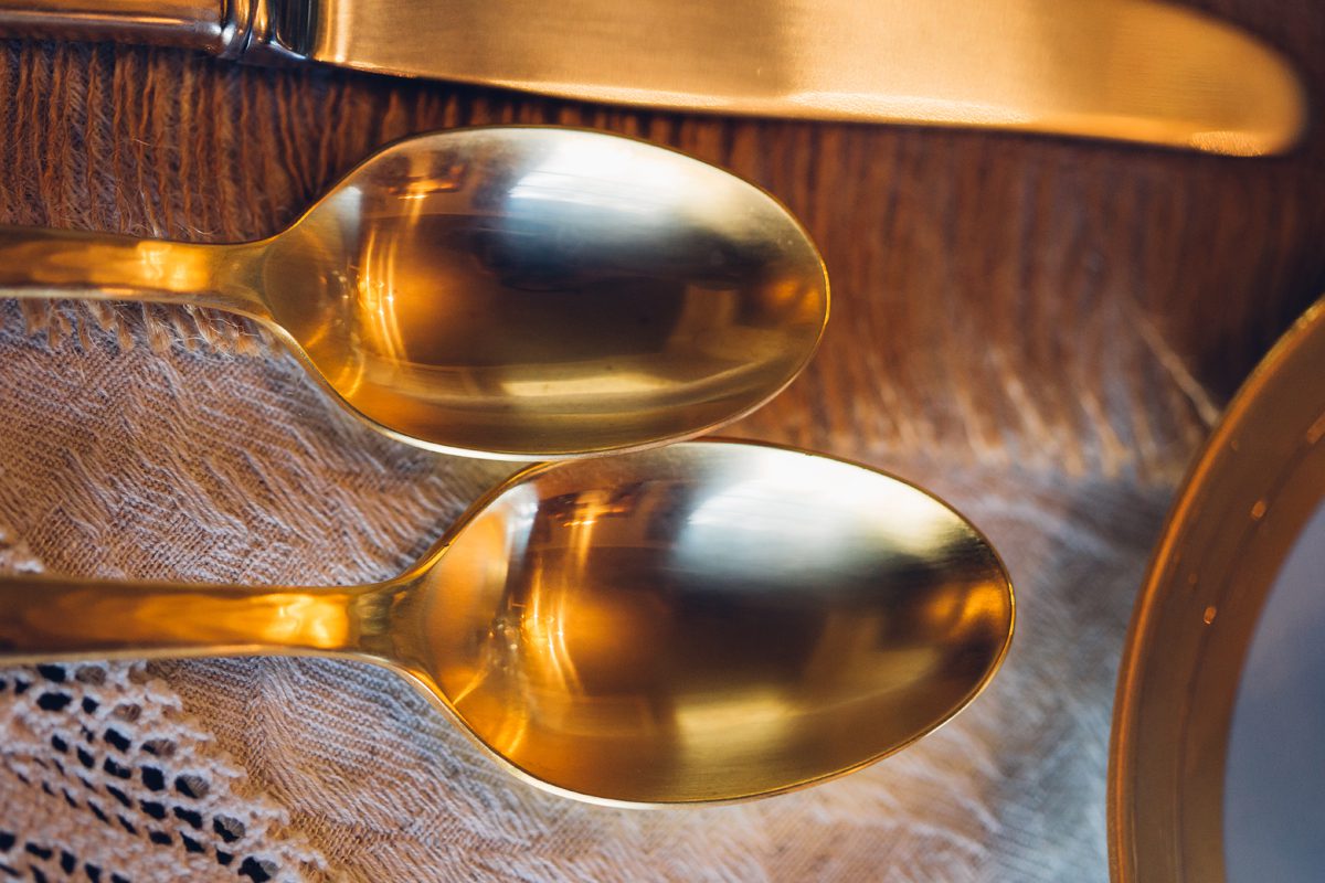
Mixing and contrasting of metals is on the rise with detailing playing a key role.
Polished and matte are equally strong and often being seen juxtaposing in the same
piece. While texture and finishes are contrasted, so are colors. Many pieces are
mixing sliver and brass, and silver and copper.
This is a nod to Art Deco which is on the rise. The Art Deco style interpretation is
definitely cleaned up and tailored. It is more influenced by basic shapes and less by
the curvy more familiar persons of the classic. Think more about the detail and
finish and less about the shape of the piece. You’ll see small detailing patters of
herringbone and intricate repetitive and rhythmic designs. Geometrics are the basis
of this style and movement. Circles and square seem to dominate.
Silver is not going away; it just gave up a share of design to gold. Gold is as strong as
ever and is not giving up the lead. It is often paired with navy and purple for a rich
jeweled palette. Watch for bronze. It is the perfect metal that is warm without the
bling. We are seeing it fresh and with warm red undertones in lieu of super dark
heavy bronze from the past few decades. Watch for copper, too as it is still on the
rise.
Finishes aren’t just metals, but shagreen and natural skins like vellum and
parchments. Leather is never wrong if it used right. It is so tactile and warms up a
space so effortlessly. Leather is showing up on everything from small boxes to all
sorts of case goods (dressers, chests, side tables). Also keep in mind, animal skins
are mixing in naturally with the jungle themes with textiles having big oversized
leaves creating a hidden garden feel.
Concrete is pretty solid not only in material, but as a very basic element that can be
dressed up or down. Because of the elemental characteristic of the material, it
seems to work everywhere. Concrete surfaces offer a modern feel that blends with
any style for both interior and exterior designs. Concrete benches are being utilized
in commercial interiors and personal gardens. Concrete tables are seen inside and
out, high end and industrial. It is a surface that is easily mixed with other design
ideas.
Other hard surfaces like stone are still huge. These are resilient surfaces with mid-
tone peach and green, but deep brown or green still lead. Black and white are
always best sellers. Dark red marble is the primary trend at this time. BOLD veins
are leading over light veining. Stone is an easy statement piece that can have much
to say.
More solid materials include semiprecious stones. Agate, amethyst, and black
tourmaline will take the lead. Glass with organic textures to mimic are a hot topic as
well as reverse painted glass. This is sometimes gold or silver leaved, with take on
all kinds of designs including traditional Églomisé. A mirror finish is produced from
applying a design a gilding to the rear face of glass.
Jumping from glass to acrylic is not a giant leap. Acrylic is still strong in all kinds of
categories. It continues to be popular for its function without adding more design
elements and its ability to ‘clean up’ a room. A great example is the purposeful
coffee table that does not add visual clutter or the forever famous “ghost chair.”
Furnishings cannot only be acrylic but can also be wood such as royal ebony and
exotic wood or 3D texturing of wood can make for a unique and rich dining set.
Woods are sporting a more defined grain. A celebration of the distinctiveness from
each piece of nature is a narrative in some designs with defined grains taking center
stage.
At the end of the day, there are trends that rise and fall. Whether it be green or
blush or blue or concrete or wood or semiprecious stones, you have to choose what
is right for you. The only way to decorate your space is to connect with a style and
palette that evokes emotion in your deepest core. That is the part that delights your
spirit and lets you know that you “are home.”
