


Space: interiors was recently hired to work in a perfectly lovely home built in the mid 1980’s in Spring Lake. It had been, unfortunately, bathed in a “blah of beige and darker earthier tones of the 1990s, which certainly did NOT represent this youngish couple, their sweet lil daughter and A-dorable new addition to the family, a mini Schnauzer named Sophie.
We were tasked with freshening up this space to better fit the family and I gotta tell ya, I love EVERYTHING about their new style!
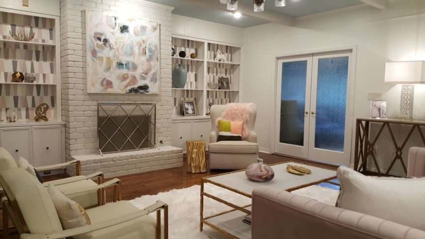
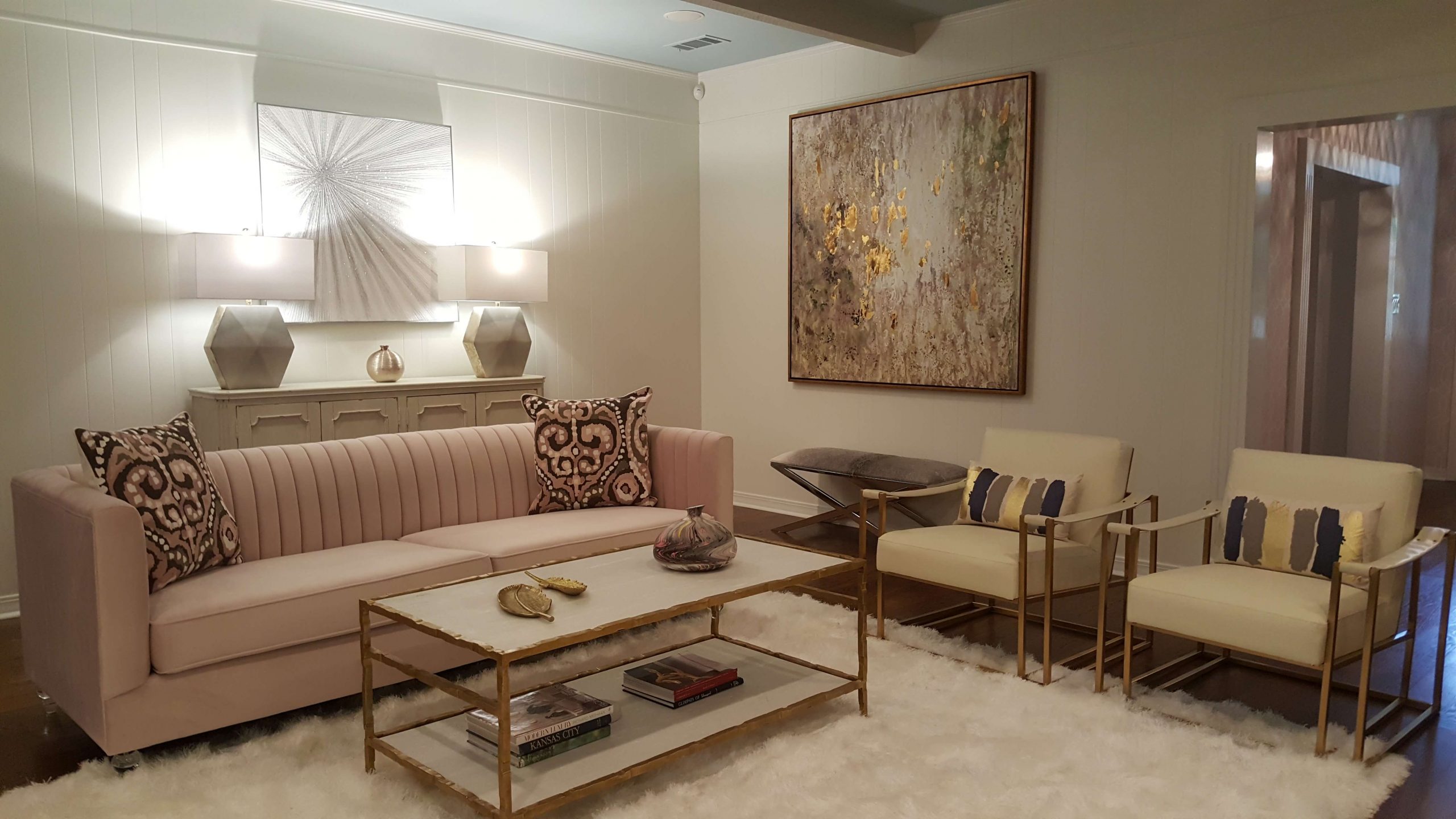
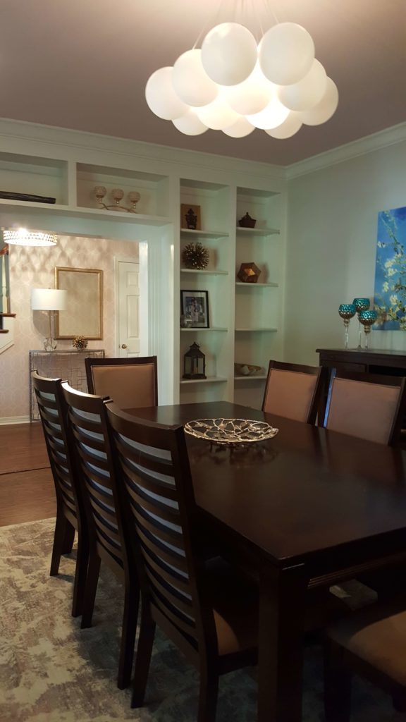
We were given very little direction other than “we just want an entirely different look.” Their new palette of blush/white/sky-blue/grey was pulled from an existing abstract painting hung in the formal dining room. It was entirely too large for the space and too cool to be in the least-used room in the home. It was going to be moved into the living area.
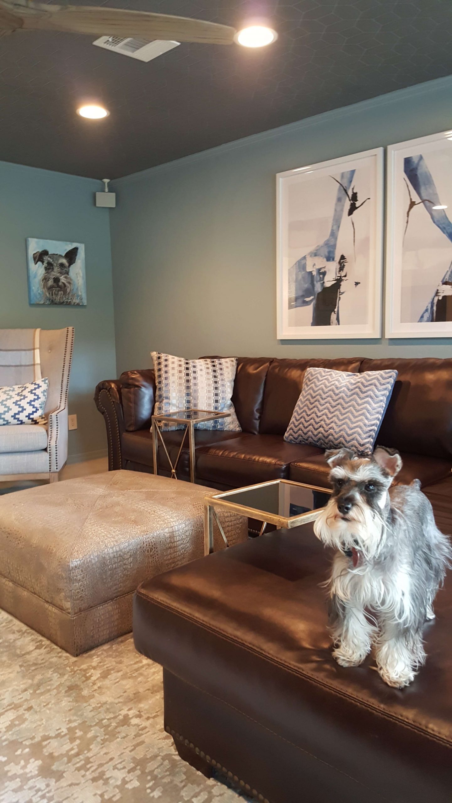
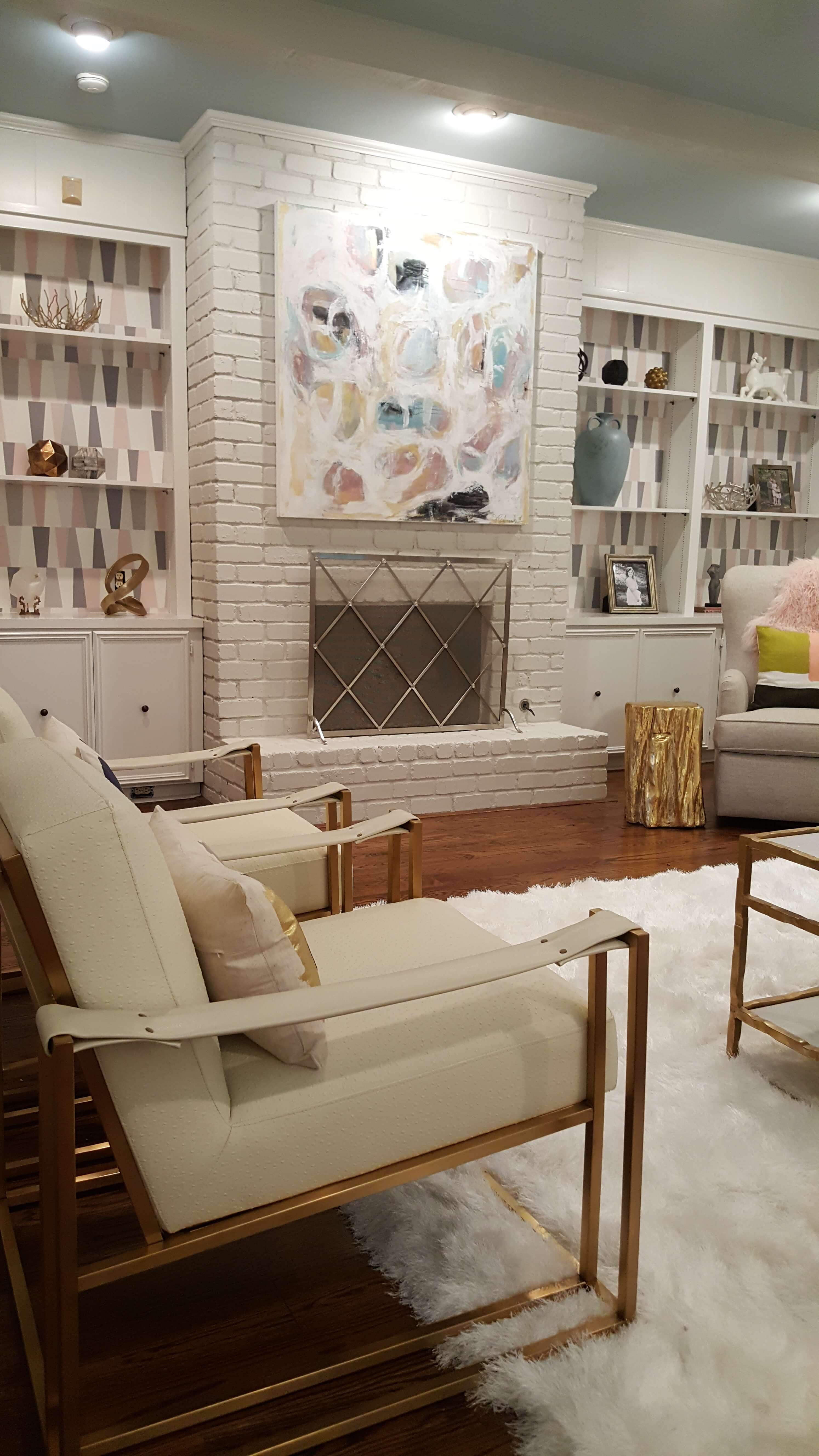
The living room was the primary focus of new purchases but, we also dolled up the adjacent den, foyer, breakfast area and dining room. I like to reuse as many items as possible but sometimes, things just haveta go! The living room originally held a large brown leather sectional and ottoman, which looked clumsy in a more formal space but fit nicely into the adjacent den. These items were replaced with a sleek lucite-legged sofa in blush velvet and gilded steel and marble coffee table. Two modern chairs with faux ostrich leather anchor one side of the room. I love these chairs because they add a contemporary punch to the otherwise transitional space and the “architecture” of the chairs is finished in antique brass, which is carried throughout the home. It is imperative to have unifying elements in your design. These lil designer “tricks” are: color, shape, repeating pattern or textures. Your eye may not immediately pick up on these elements but will recognize the overall space as unified with continuity. A swivel chair (Sophie’s new favorite spot) now sits angled next to the freshly painted fireplace. The wallpapered backs of the shelves make for a great backdrop and add a cool modern pop! A modern abstract by Jennifer Psalmonds now hangs over the mantel-free fireplace and continues our color palette. The wallpapered back of the shelves makes for a great backdrop and adds a cool modern pop! New art and console sit across the room with lamps flanking an abstract with glitter mixed into the paint. A plush, deep, shag rug (Sophie’s 2nd favorite spot) nestles underfoot and beautifully grounds the space.
 We swapped clear for ‘”rain” glass on the double doors entering the den. This maintains natural light for the living area but separates the two and keeps the big brown sectional tucked outta sight when closed…Ha! The den is officially the “testosteroom.” We had all the walls/doors/molding/cabinets painted in Debonair Blue and added a graphic wallpaper on the ceiling to compliment the sectional (Sophie’s 3rd favorite spot). New carpeting, area rug and chair finish off this space.
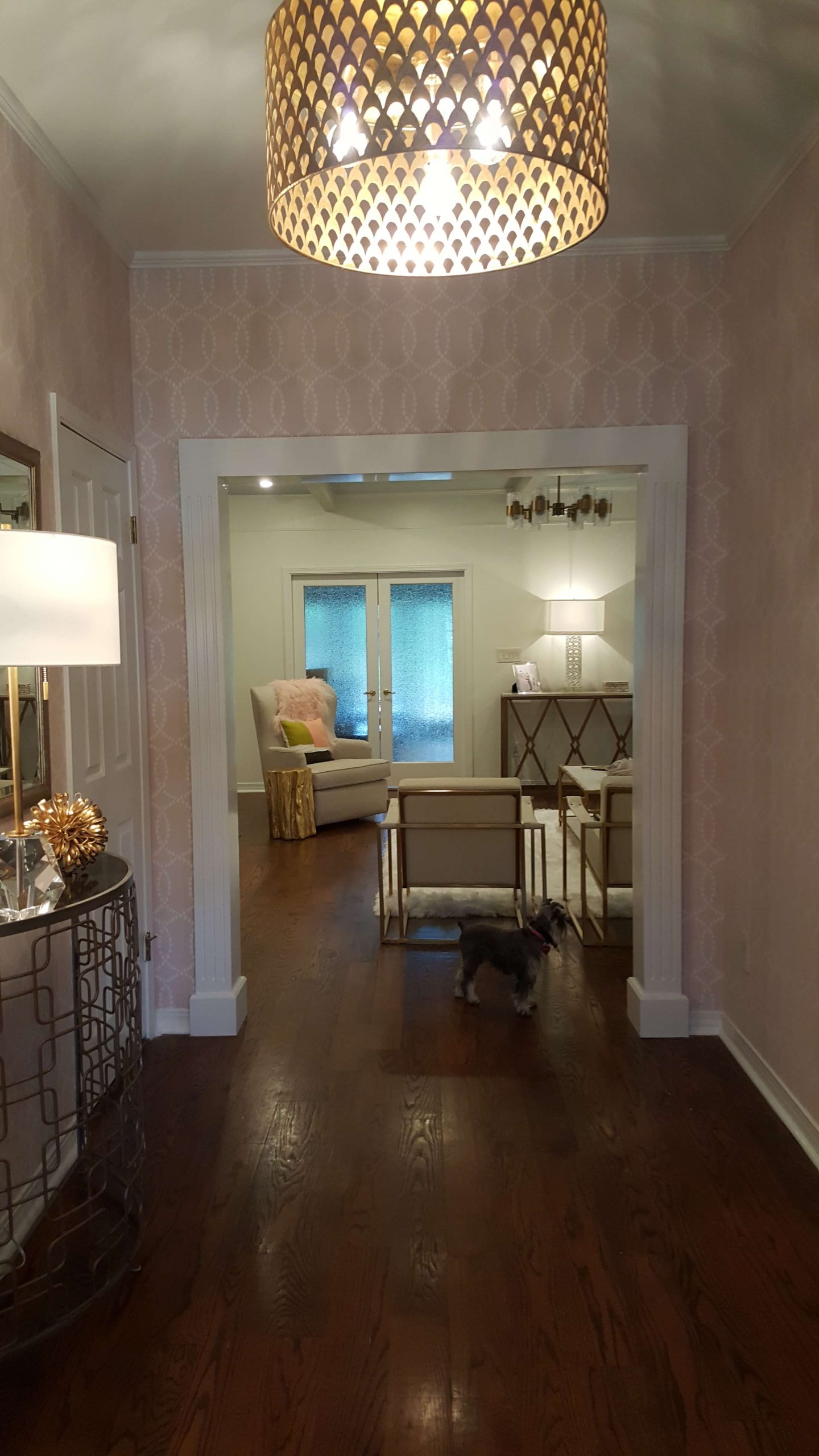
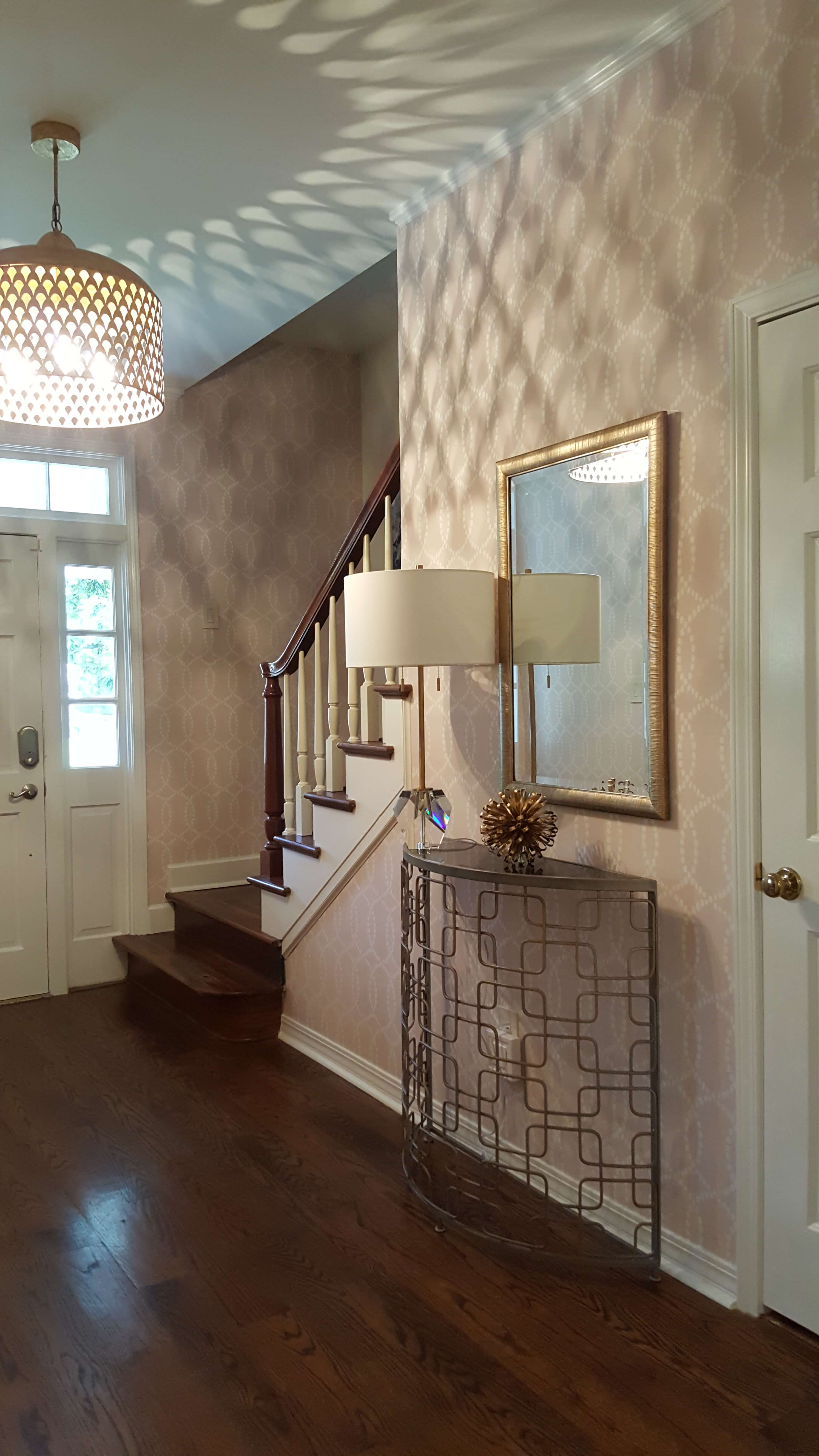
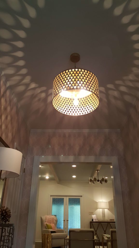
New lighting throughout is highlighted by a balloon chandelier in the dining room. The foyer now is covered in a delicate blush wallpaper of intertwining circles and crowned with a gorgeous gold chandelier, which throws an amazing shadow play when on.
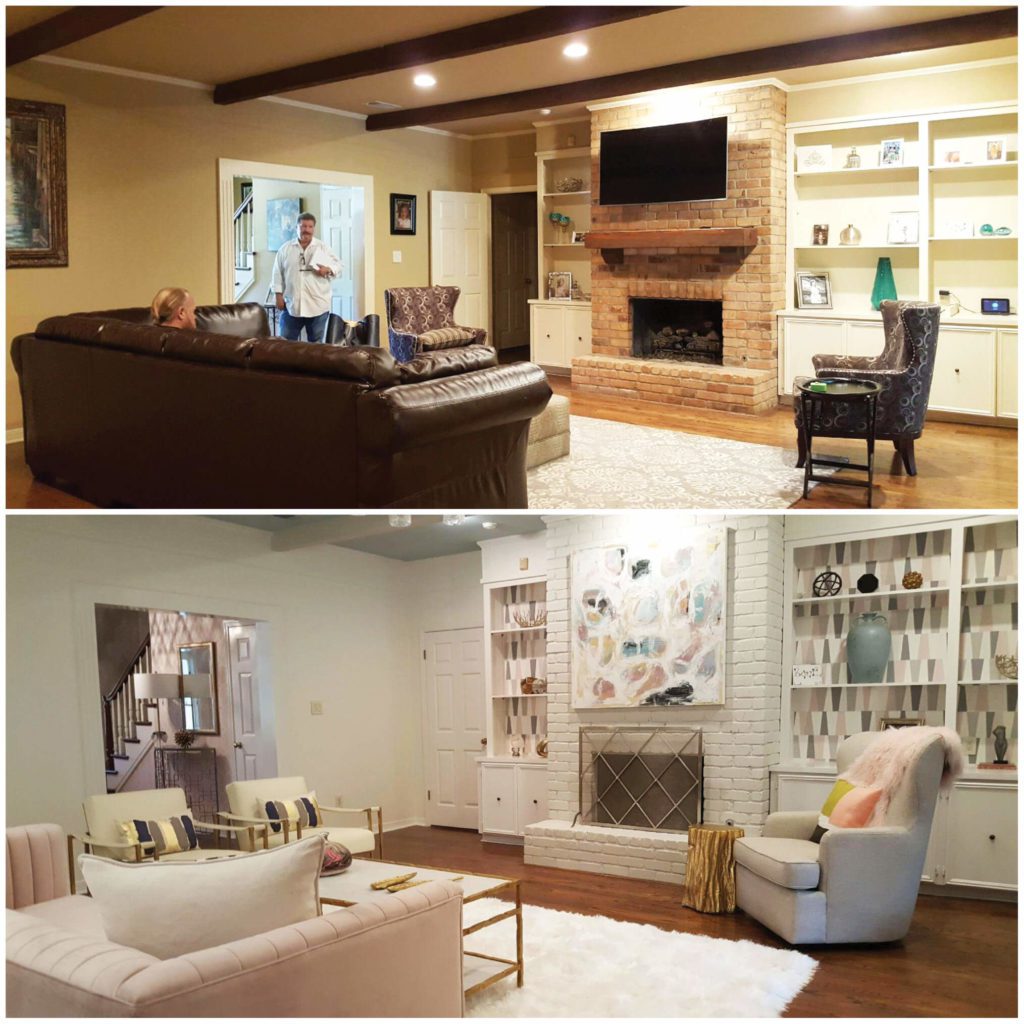
Top(before), Bottom (after)
As you can see, you don’t need a brand-new home to have a brand-new look! All it takes is a designer’s eye to teach your old dog a few new tricks!